Layouts in Flutter
Layouts in Flutter consist of a hierarchy of widgets with the outer widgets usually deal with aligment and structure whereas the inner elements are usually the visible elements on the page itself,like buttons and images,etc.
Center(
 child: Column(
   mainAxisAlignment:MainAxisAlignment.center,
   children:<Widget>[
    Text(
    'You have pushed the button this many times:',
    ),
    Text(
    '$_counter',
    style:Theme.of(context).textTheme.display1,
    ),
   ]
  )
)
In this example,there are three widgets:Center,Column and Text.
The Center and Column deal with structuring and aligning the elements inside them whereas the Text is the only directly visible element in the app for a user.
A widget usually has properties for changing alignment,styles and attributes.
Let us now dive into individual widgets and see what they do.
We will split widgets into two rough categories:
- Visible Element Widgets
- Structuring and Alignment Widgets
Visible Element Widgets
These are a few commonly used Widgets
- Text
A Text widget simply holds some text.
Text(
  'Hello World!',
  textAlign: TextAlign.center,
  style: TextStyle(fontWeight: FontWeight.bold),
)
The text can be aligned using the textAlign property.The style property allows customisation of the text including font,font size,font weight,color,letter spacing and a whole lot more.
- Button
A Button widget allows a user to perform some action on click.Flutter does not have a direct “Button” widget,instead,it has types of button like a FlatButton and a RaiseButton.
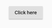
FlatButton(
 child:Text('Click here'),
 onPressed:(){
 // Do something here
 }
 )
The FlatButton does not stand out from the surrounding:

The onPressed property allows some action to be performed when the button is clicked.
 RaisedButton(
  child: Text('Click here'),
  elevation: 5.0,
  onPressed:(){
  //Do something here
  }
)
The RasiedButton is raised from the environment:
Changing the elevation of the RasiedButton changes how much it stands out.
- Image
The Image widget holds an image and can fetch it from multiple sources like assets or even directly from a URL.In normal native Android this would have required a secondary library like Picasso.
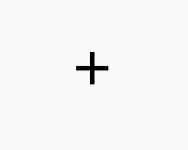
- Icon
The icon widget is a container for an icon in Flutter.
Icon(
 Icons.add,
 size:36.0,
)
It also contains a size attribute to enlarge the icon.
Structuring and Alignment Widgets
- Column
A Column is a widget which arranges all its children widgets in a vertical stack. It can space the widgets according to the mainAxisAlignment and crossAxisAlignment property.Here the “main axis” is the vertical axis and the “cross axis” is the horizontal axis.
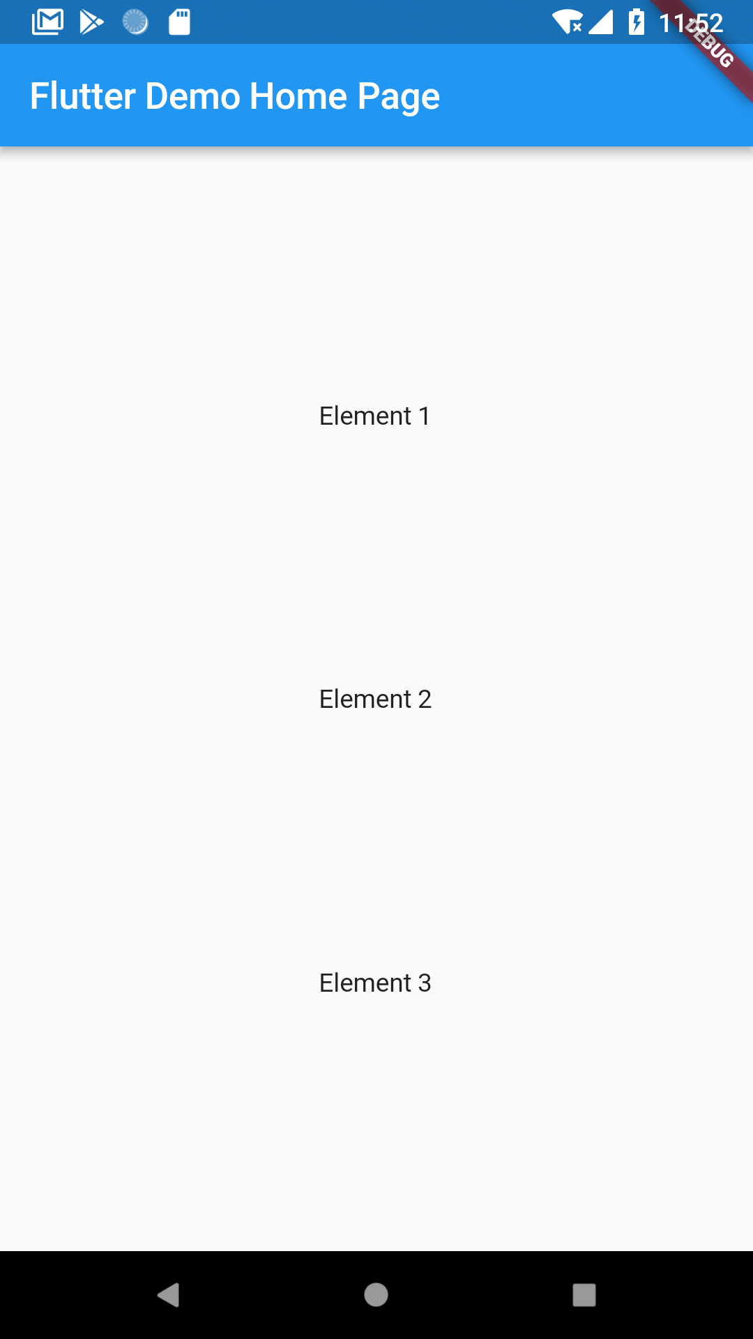
Lets construct a column of 3 text widget.
Column(
 mainAxisAlignment: MainAxisAlignment.center,
 chilren:<Widget>[
  Text('Element 1'),
  Text('Element 2'),
  Text('Element 3'),
 ]
)
The column has 3 text widgets inside it and the mainAxisAlignment is set to ‘center’.
This is how it looks like:
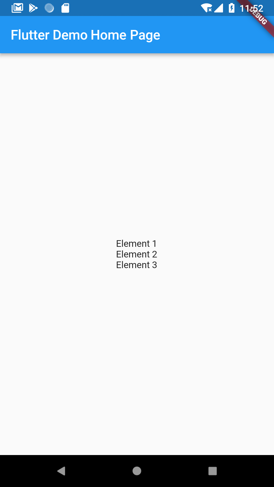
Because of the mainAxisAlignment being center,it centers all the widgets.
Let’s try something else.Let’s set mainAxisAlignment to spaceBetween.
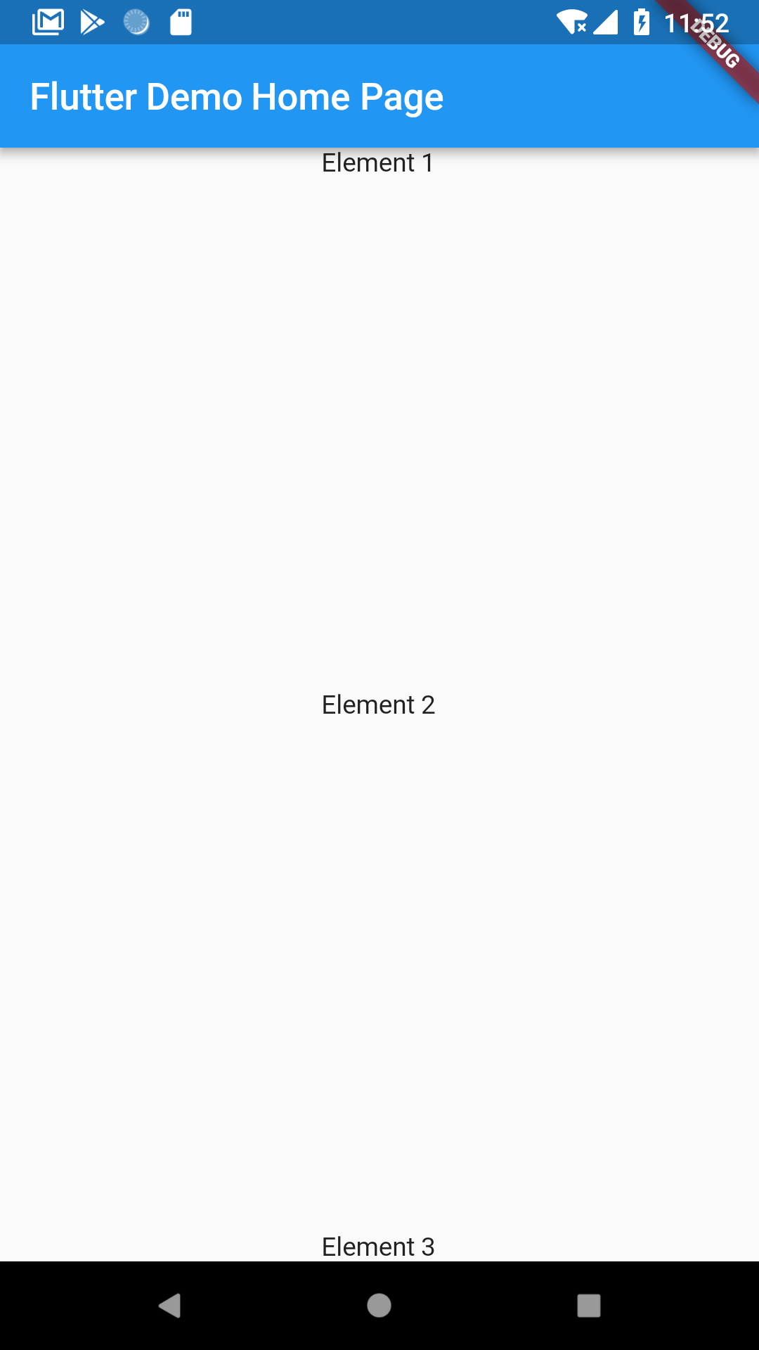
Now they’re too far apart,let’s try spaceEvenly.
To space it in between the left and right sides of the screen,you have to use crossAxisAlignment.
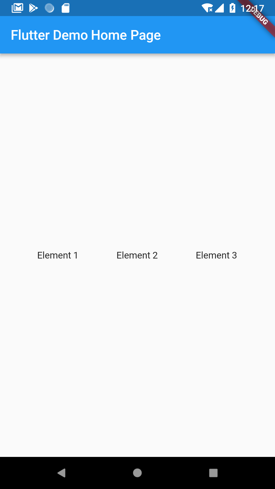
- Row
Row(
 mainAxisAlignment:MainAxisAlignment.spaceEvenly,
 children: <Widget>[
  Text('Element 1'),
  Text('Element 2'),
  Text('Element 3'),

 ]
)
A Row is the same as a column but constructs a horizontal row of widgets rather than a column.The main difference here is the main axis is the horizontal axis rather than the vertical one. The cross axis is the veritcal axis.
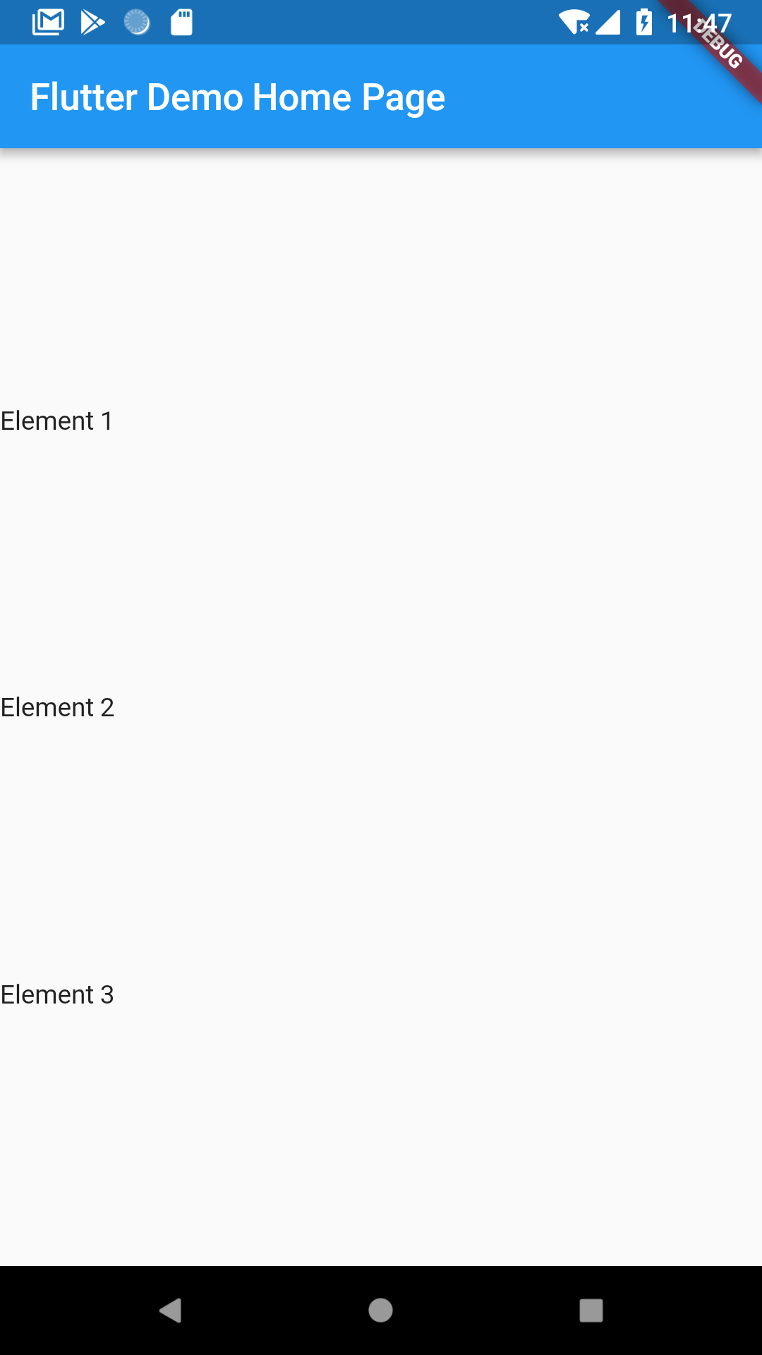
- Center
A Center widget simply centers the child inside it.All the previous examples included rows and columns that were inside a center widget. If the column was not inside a center widget,it would shift to the left.Here’s an example:
Column without a center widget:
Column with a center widget:
Center(
 child: Row(
  mainAxisAlignment:MainAxisAlignment.spaceEvenly,
  children:<Widget>[
   Text('Element 1'),
   Text('Element 2'),
   Text('Element 3'),
  ]
 )
)
A Center widget simply takes a child and centers it in the available space it is in.
- Padding
Unlike in normal Android development wehere every view has its own padding attribute, padding is a widget that wraps other widgets to give them padding in all or specified directions.
This gives the text widget a padding of 8.0 in all directions.
Padding(
 padding:const EdgeInsets.all(8.0),
 child: Text('Element 1'),
)
Padding in specific directions is also allowed.
Padding(
 padding:const EdgeInsets.fromLTRB(8.0,0.0,0.0,0.0),
 child:Text('Element 1'),
)- Scaffold
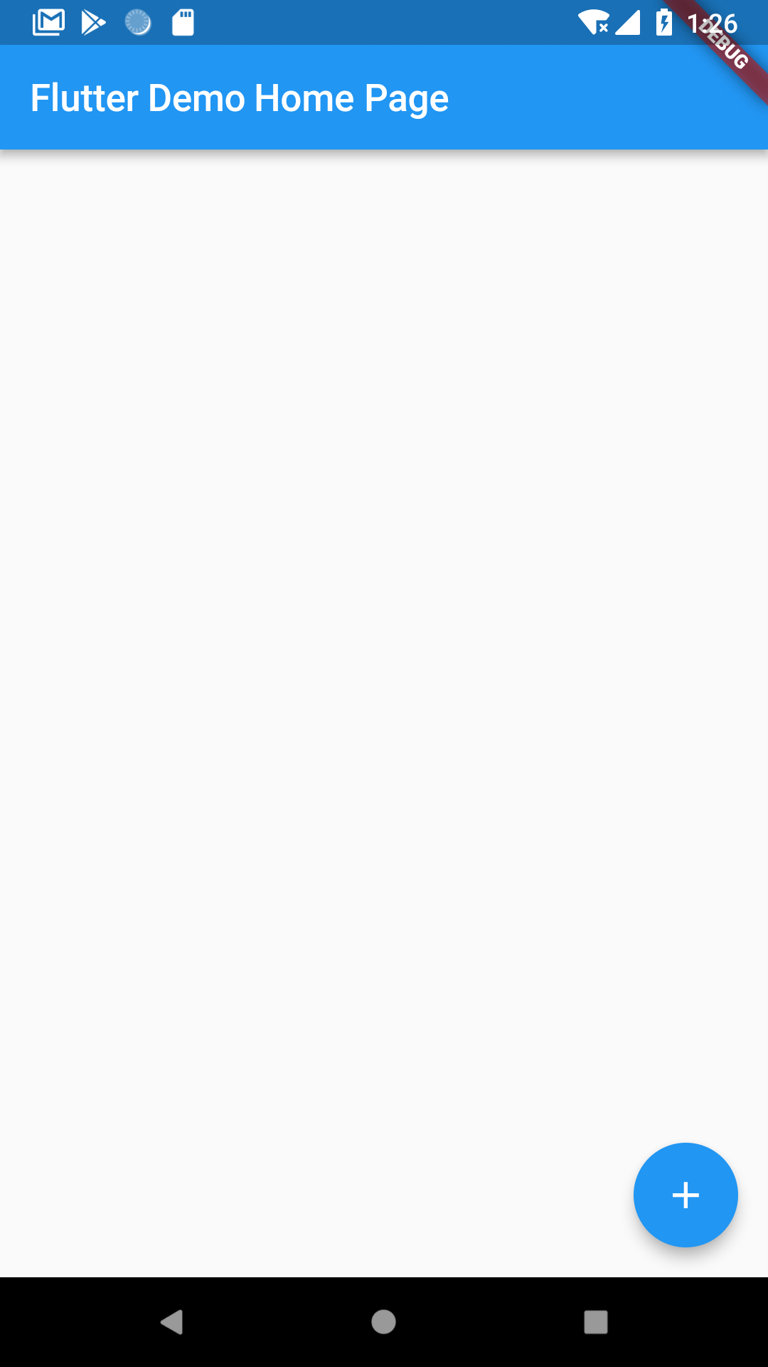
A Scaffold Widget provides a framework for adding common material design elements such as AppBar,Drawer,Floating Action Buttons,Bottom Navigation,etc.
Scaffold(
 appBar:AppBar(
  title:Text(widget.title),
 ),
 body:Center(),
 floatingActionButton:FloatingActionButton(
  child:Icon(Icons.add),
  onPressed:(){}
 ),
)
Adding material elements becomes easier using a Scaffold.
- Stack
A Stack is used to overlap widgets,like a button on a background gradient. A Stack is a very important widget.
These are the basic widgets required to make a decent functioning app in Flutter.Flutter also allows you to make your own widgets if you need any other functionality added or if you want to reuse some repeating widget pattern.
For the complete list of Flutter widgets,visit this link.