Implicitly Animated Widgets in Flutter
Animations are quite easy to do in Flutter and a lot of complexity can be achieved with a lot of less effort than native Android.This is usually achieved through ways like defining an Animation + an AnimationController.But there are inbuilt widgets which even reduce this and make animations as easy as simply changing values!
AnimatedContainer
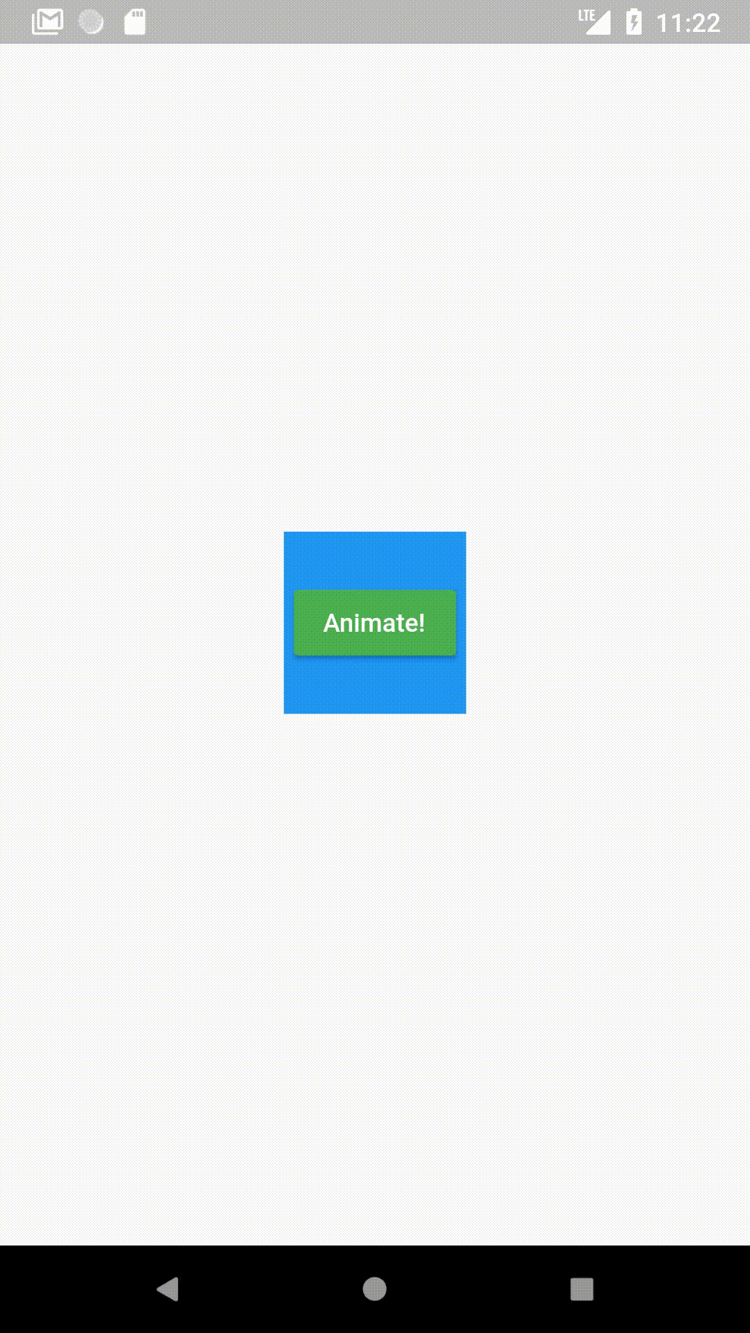
An AnimatedContainer automatically transitions to the values defined(colors,size etc.)instead of just instantaneously changing to them.The GIF given above is an example of an AnimatedContainer.
The code will be:
import 'package:flutter/material.dart';
class DeepDiveHome extends StatefulWidget {
_DeepDiveHomeState createState() => _DeepDiveHomeState();
}
class _DeepDiveHomeState extends State<DeepDiveHome> {
var myColor = Colors.blue;
var myHeight = 150.0;
var myWidth = 150.0;
bool isShrine = false;
Widget build(BuildContext context) {
return Scaffold(
body: Center(
child: AnimatedContainer(
duration: Duration(seconds: 1),
child:
ButtonBar(alignment: MainAxisAlignment.center, children: <Widget>[
RaisedButton(
elevation: 5.0,
color: Colors.green,
child: Text(
'Animate!',
style: TextStyle(
color: Colors.white,
fontSize: 15.0,
fontWeight: FontWeight.bold),
),
onPressed: () {
if (!isShrine) {
myColor = Colors.green;
myHeight = MediaQuery.of(context).size.height;
myWidth = MediaQuery.of(context).size.width;
} else {
myColor = Colors.blue;
myHeight = 150.0;
myWidth = 150.0;
}
isShrine = !isShrine;
setState(() {});
},
),
]),
color: myColor,
height: myHeight,
width: myWidth,
),
));
}
}In normal cases,you would define a controller and a Tween and a ColorTween to achieve the animation in the GIF above. But with AnimatedContainer,all you have to do is:
- Set a duration for the animation
duration: Duration(seconds: 1);- Change values (Change color and size to your values)
myColor = Colors.green;
myHeight = MediaQuery.of(context).size.height;
myWidth = MediaQuery.of(context).size.width;- setState()
setState((){});No controller.No Tweens
The moment you change the values of myColor,myHeight,myWidth and setState(),the container automatically transitions to the values instead of changing directly to that value.
onPressed:(){
 myColor = Colors.green;
 myHeight = MediaQuery.of(context).size.height;
 myWidth = MediaQuery.of(context).size.width;
}
At the beginning,myColor was set Colors.blue.When we change it to Colors.green and setState to rebuild it,it transitions from blue to green without any Tweens used.(Note:Tweens are used implicitly but do not need to be user defined.)
From what I’ve seen,a lot of developers don’t seem to be aware of these implicitly animated widgets and waste time when it’s not necessary. Obviously there will be cases where you might want a different kind of behaviour,but
most times,AnimatedContainer does the job.
Hero Animations
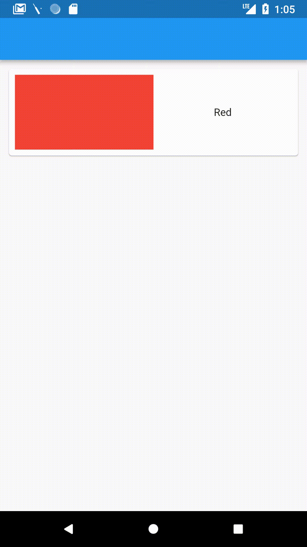
A Hero animation makes an element from one page “fly” to the second and automatically adjust to the size of the same element on the second page.This makes something like a list in an app which has a detail page that much more interesting.
Flutter makes it incredibly easy to implement Hero Animation.All you have to do is wrap the element you want to make a ‘Hero’ with a Hero widget and supplu to it a tag.
If you want to do this in a list,you need to supply a different tag for each element, which I just usually set to “hero” + position of element in the list.
The code will be:
import 'package:flutter/material.dart';
class DeepDiveHome extends StatefulWidget {
_DeepDiveHomeState createState() => _DeepDiveHomeState();
}
class _DeepDiveHomeState extends State<DeepDiveHome> {
Widget build(BuildContext context) {
return Scaffold(
appBar: AppBar(),
body: Column(
children: <Widget>[
Padding(
padding: const EdgeInsets.all(8.0),
child: Card(
child: InkWell(
onTap: () {
Navigator.push(
context,
MaterialPageRoute(
builder: (context) => HeroDetailPage()));
},
splashColor: Colors.red,
child: Padding(
padding: const EdgeInsets.all(8.0),
child: Row(
children: <Widget>[
Expanded(
child: Hero(
tag: 'heroTag',
child: Container(
color: Colors.red,
height: 100.0,
),
),
),
Expanded(
child: Center(
child: Text('Red'),
),
)
],
),
),
),
),
)
],
),
);
}
}
class HeroDetailPage extends StatelessWidget {
Widget build(BuildContext context) {
return Scaffold(
body: Column(
children: <Widget>[
Expanded(
child: Hero(
tag: 'heroTag',
child: Container(
color: Colors.red,
),
),
),
Expanded(
child: Container(
child: Center(
child: Text(
'This is the color red.',
style: TextStyle(fontSize: 30.0),
)),
))
],
),
);
}
}That’s it!
The colored container automatically files and expands to the latter’s size.
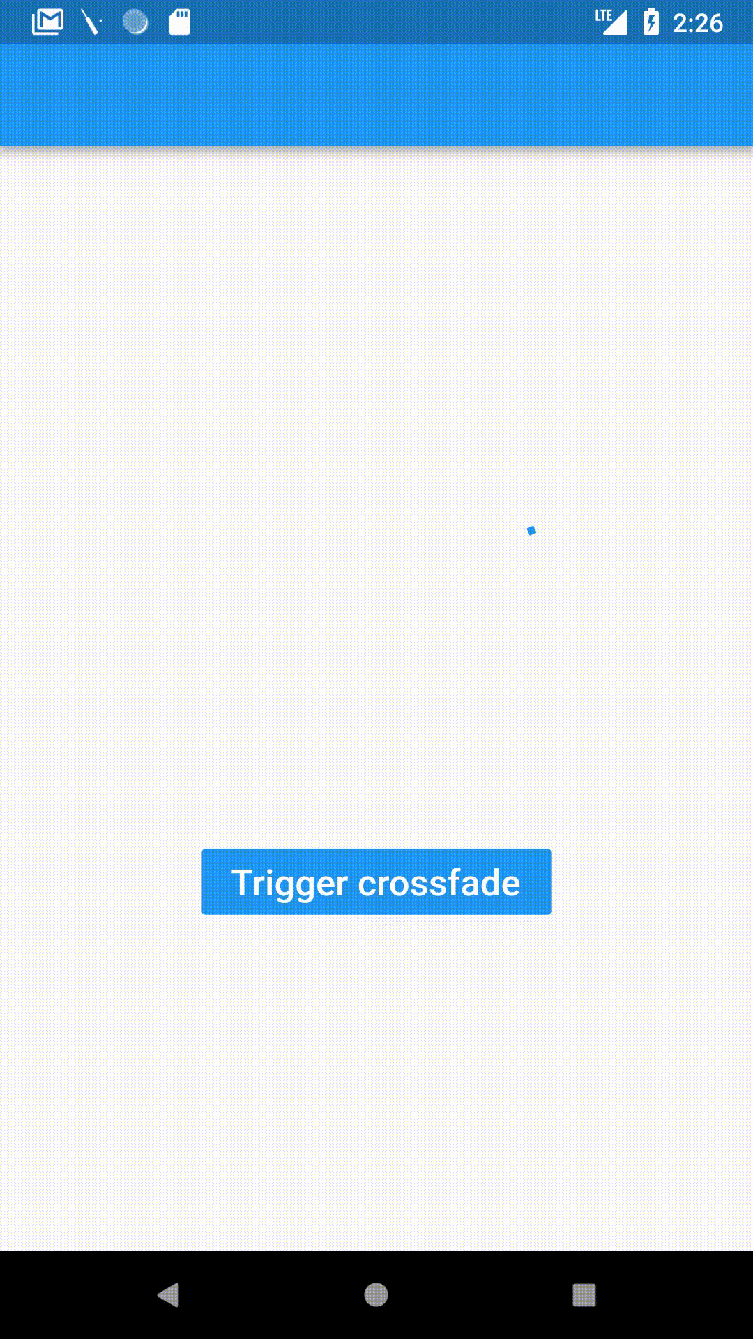
AnimatedCrossFade
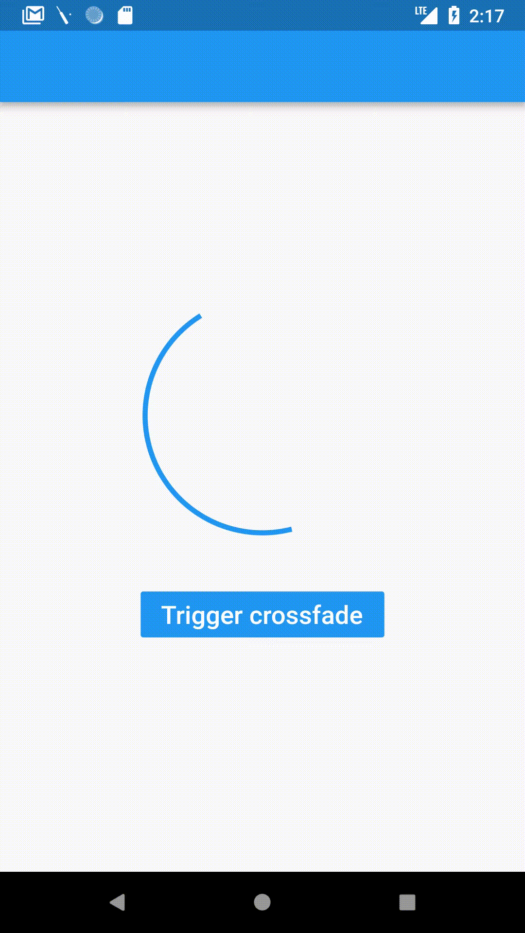
A CrossFade is a smooth transition from one widget to another with a given duration.Flutter makes this easy using a AnimatedCrossFade widget.
This is how an AnimatedCrossFade is defined:
AnimatedCrossFade(
 firstChild://Your first element here,
 secondChild://Element after transition,
 crossFadeState://State of the transition,
 duration:Duration(milliseconds:1500),
)
We supply:
- The widget before transition
firstChild:Container(
 child:Padding(
  padding:const EdgeInsets.all(8.0),
  child:CircularProgressIndicator(),
 ),
 height:200.0,
 width:200.0,
)- The widget after transition
secondChild:Container(
 child:Padding(
  padding:const EdgeInsets.all(8.0),
  child:FlutterLogo(),
 ),
 height:100.0,
 width:200.0,
)- The state of transition (If the transition has happened already or not)
(Here,firstStateEnabled is a boolean we can change to change the state.)
crossFadeState:firstStateEnabled
?CrossFadeState.showFirst
:CrossFadeState.showSecond,- The duration of the transition
duration:Duration(milliseconds:1500),This amount of code is enough to give us the above example.The transition is simply triggered by changing the crossFadeState.
import 'package:flutter/material.dart';
class DeepDiveHome extends StatefulWidget {
_DeepDiveHomeState createState() => _DeepDiveHomeState();
}
class _DeepDiveHomeState extends State<DeepDiveHome> {
var firstStateEnabled = false;
Widget build(BuildContext context) {
return Scaffold(
appBar: AppBar(),
body: Center(
child: Column(
mainAxisAlignment: MainAxisAlignment.center,
children: <Widget>[
AnimatedCrossFade(
firstChild: Container(
child: Padding(
padding: const EdgeInsets.all(8.0),
child: CircularProgressIndicator(),
),
height: 200,
width: 200.0,
),
secondChild: Container(
child: Padding(
padding: EdgeInsets.all(8.0),
child: FlutterLogo(),
),
height: 200.0,
width: 200.0,
),
crossFadeState: firstStateEnabled
? CrossFadeState.showFirst
: CrossFadeState.showSecond,
duration: Duration(milliseconds: 1500),
),
Padding(
padding: const EdgeInsets.all(32.0),
child: RaisedButton(
color: Colors.blue,
child: Text(
'Trigger crossfade',
style: TextStyle(
color: Colors.white,
fontSize: 20.0,
fontWeight: FontWeight.bold,
),
),
onPressed: () {
setState(() {
firstStateEnabled = !firstStateEnabled;
});
},
),
)
],
),
),
);
}
}Note:If the two children are of different sizes then it automatically transitions from one size to the other.
AnimatedOpacity
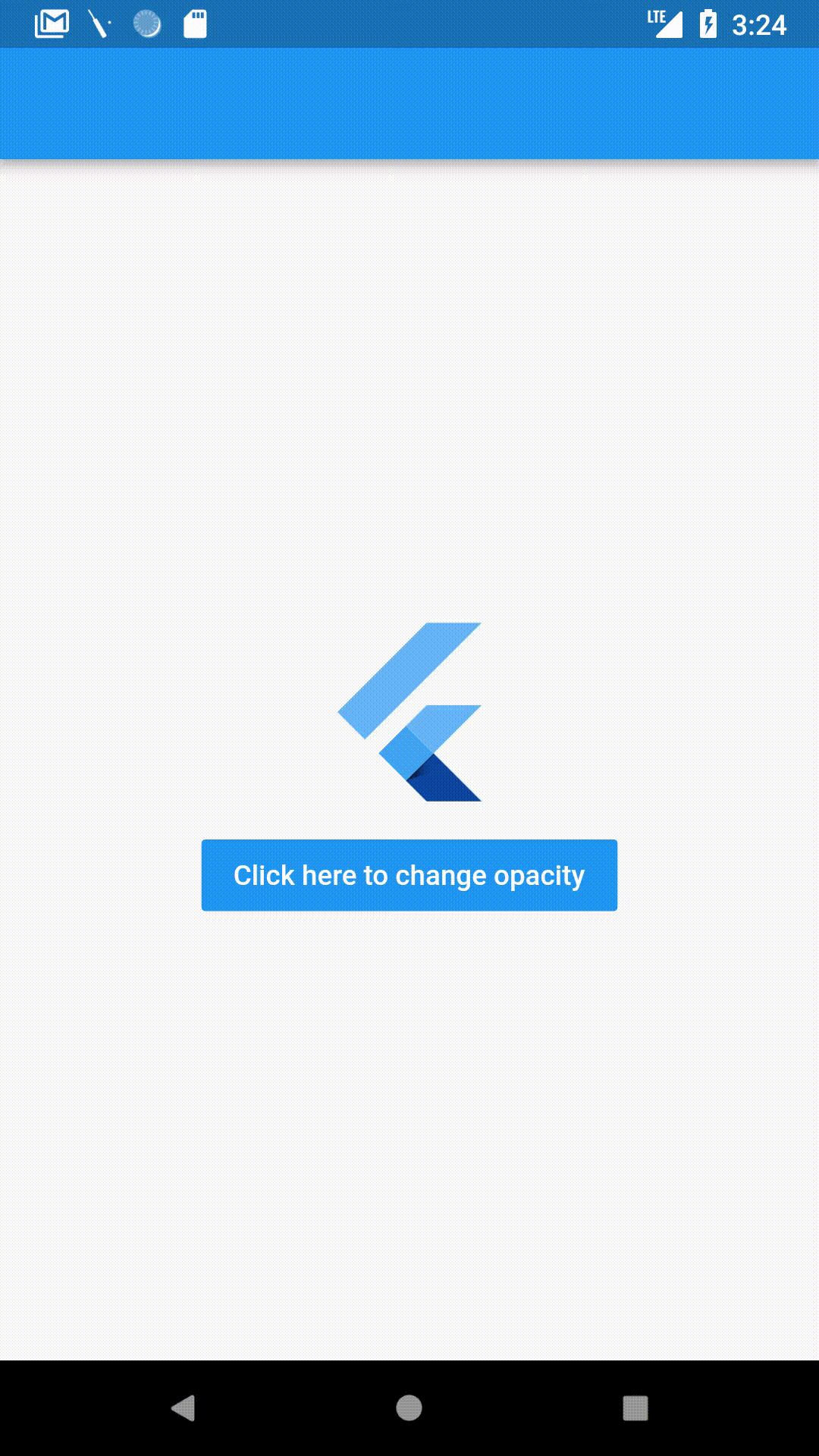
AnimatedOpacity animates changes in opacity,i.e. how visible a widget is.An Opacity of 0 makes a widget completely transparent,while a 1 opacity is fully visible.
AnimatedOpacity is declared as:
AnimatedOpacity(
 opacity://Your variable holding opacity value,
 duration://Duration of the transition,
 child:FlutterLogo(),
)
Staying similar to the last few widgets,in AnimatedOpacity,you change the opacity and setState and it automatically animates the opacity change.
In the above example,it is declared as:
AnimatedOpacity(
 child:FlutterLogo(size:100.0,),
 opacity:myOpacity,
 duration:Duration(seconds:1),
)
When the button is clicked,it simply changes opacity and sets state.
onPressed(
 myOpacity = 0.0;
 setState((){});
)
The above example’s code is here:
import 'package:flutter/material.dart';
class DeepDiveHome extends StatefulWidget {
_DeepDiveHomeState createState() => _DeepDiveHomeState();
}
class _DeepDiveHomeState extends State<DeepDiveHome> {
var myOpacity = 1.0;
Widget build(BuildContext context) {
return Scaffold(
appBar: AppBar(),
body: Center(
child: Column(
mainAxisAlignment: MainAxisAlignment.center,
children: <Widget>[
Padding(
padding: const EdgeInsets.all(8.0),
child: AnimatedOpacity(
child: FlutterLogo(
size: 100.0,
),
opacity: myOpacity,
duration: Duration(seconds: 1),
),
),
RaisedButton(
color: Colors.blue,
child: Text(
'Click here to change opacity',
style: TextStyle(
color: Colors.white,
fontSize: 20.0,
fontWeight: FontWeight.bold,
),
),
onPressed: () {
myOpacity = 0.0;
setState(() {});
},
)
],
),
),
);
}
}