Introduction
A Stack widget allows us to make multiple widgets overlay each other.This not only allows brilliant custom designs but also some really cool animations.
There are two main types of Stacks:
- Stack
- IndexedStack
Let’s explore the use of Stacks.
Stack
The Stack widget allows us to put up multiple layers of widgets onto the screen.
The widget takes multiple children and orders them from bottom to top.So the first item is the bottommost and the last is the topmost.
Stack(
 children: <Widget>[
  BottomWidget(),
  MiddleWidget(),
  TopWidget(),
 ]
)
A visual representation of the layers of the Stack:
This size of the Stack is the size of the largest member in the layar,So if the bottom layer covers the complete screen then the size of the Stack is the complete screen.
Each member in the stack needs to be positioned or aligned,or else it ends up in the top left corner bu default.
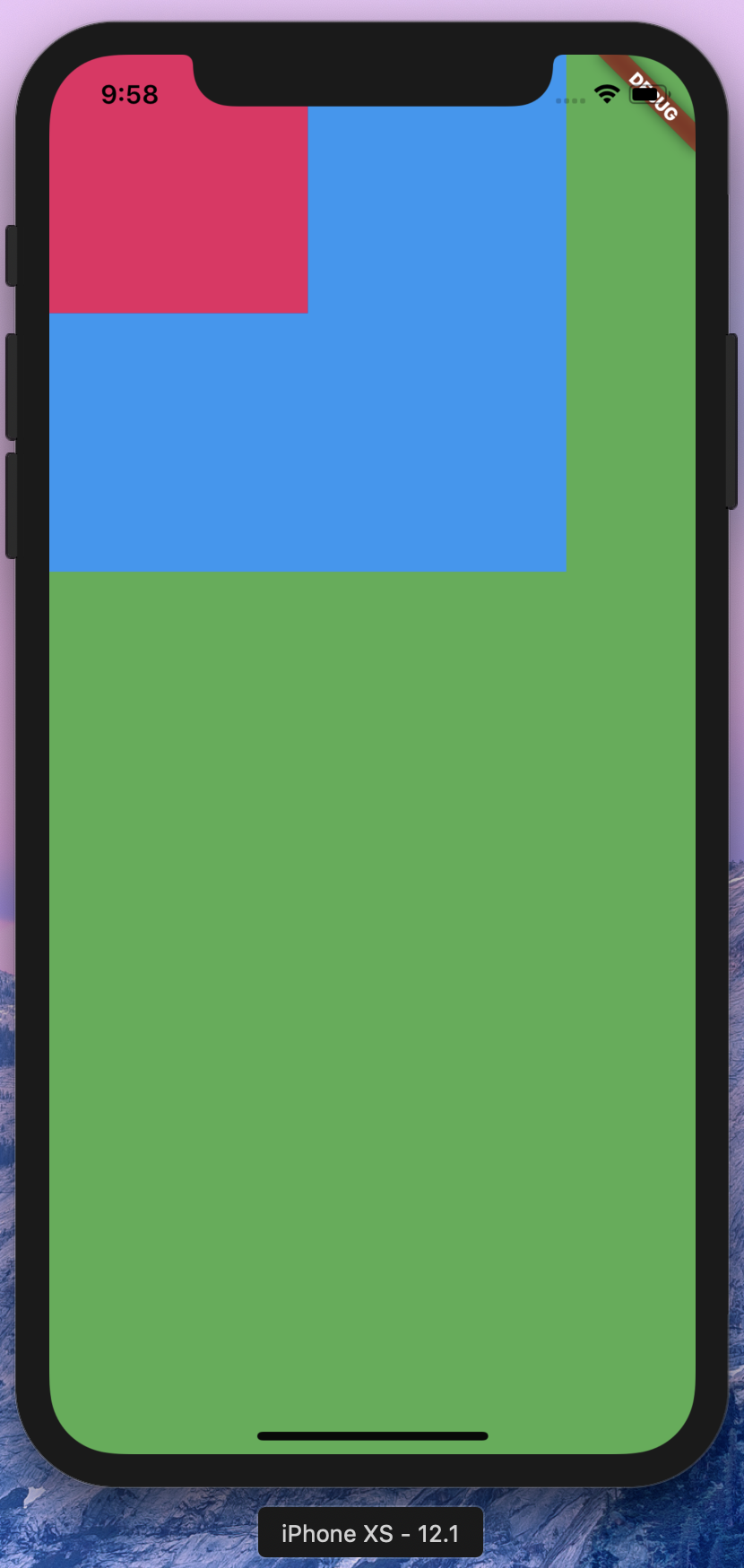
As an example,let’s take three containers of shrinking size:
Widget build(BuildContext context) {
    return Scaffold(
        appBar: AppBar(
          title: Text('Deep Dive Flutter'),
        ),
        body: Stack(
          children: <Widget>[
            Container(
              color: Colors.green,
            ),
            Container(
              color: Colors.blue,
              height: 300.0,
              width: 300.0,
            ),
            Container(
              color: Colors.pink,
              height: 150.0,
              width: 150.0,
            )
          ],
        ));
  }
This gives us:

If you notice,the containers which are smaller have a lot more area to go to and hence default to top left.To change this,you can align or position your widget using the Align or Positioned widget.
An Align widget usually takes widget to extreme positions.So for example,if we enter top-right,we need to add extra padding to keep it neat and tidy. A Positioned widget combines these two things and lets us keep one Postioned widget instead of an Align and Padding.We will see how in a while.
We’ll alter our example to use Align and Postitioned.Let’s simply wrap our containers in an Align and then a Positioned widget.
Note: Positioned has to be a child of a Stack.There cannot be another widget in between the stack and the widget.
To simply align a widget:
Align(
 alignment: Alignment.topRight,
 child: Container(
  color: Colors.pink,
  height: 150.0,
  width: 150.0,
 )
)
Here we align it to the top right.Usually,this isn’t what we actually want since we need some padding to the container from the edges.We can either use padding with Align or Positioned for more fine-grained control.
Positioned has multiple types,we’ll focus on the default. It accepts values from all four sides telling the child how far it should be away from that respective side.If no values is given,it shrinks to the lowest possible
size.
Here,we give a value to the top and right.In effect,what this means is that the child will be 40.0 away from top and right and no other constraints on the other sides.Hence,it is also aligned to the top and right sides by definition.
Positioned(
             right: 40.0,
             top: 40.0,
             child: Container(
               color: Colors.pink,
               height: 150.0,
               width: 150.0,
             ),
           )
This gives us:
Hence,Positioned is a better widget to use in a Stack than Align + Padding but there’s no real harm in either. There are also other types of Positioned.A few of them are:
Positioned.fill()
Sets top,right,bottom,left to 0.0 by default unless override. Hence,it fills the screen by default since distance from all four sides is 0.0.
Positioned.formRect()
Creates a Positioned object from a given Rect.
Before we move on to creating somthing with Stack,let’s take a look at the second type.
IndexedStack
An IndexedStack is a stack where only one element is displyed at one time by its index.
IndexedStack(
 index:1,
 children: <widget>[
  BottomWidget(),
  MidWidget(),
  TopWidget(),
 ]
)
It takes children like a usual Stack but in contrast to it,only displays one child at one time.In away,it’s not a stack and more of a way to easily switch between children when you need to.
Let’s see an example:
Widget build(BuildContext context) {
    return Scaffold(
        appBar: AppBar(
          title: Text('Deep Dive Flutter'),
        ),
        body: IndexedStack(
          index: 0,
          children: <Widget>[
            Container(
              color: Colors.green,
            ),
            Container(
              alignment: Alignment.bottomLeft,
              color: Colors.blue,
              height: 300.0,
              width: 300.0,
            ),
            Container(
              color: Colors.pink,
              height: 150.0,
              width: 150.0,
            )
          ],
        ));
  }
When we wrap the same elements with IndexedStack and give it the index 0,it shows the bottommost child.
The upper two children are not shown as the index is 0.
Note: The size is still the size of the largest element.
IndexedStack also directly takes an alignment parameter and aligns all children accordingly.
Widget build(BuildContext context) {
    return Scaffold(
        appBar: AppBar(
          title: Text('Deep Dive Flutter'),
        ),
        body: IndexedStack(
          index: 1,
          children: <Widget>[
            Container(
              color: Colors.green,
            ),
            Container(
              alignment: Alignment.bottomLeft,
              color: Colors.blue,
              height: 300.0,
              width: 300.0,
            ),
            Container(
              color: Colors.pink,
              height: 150.0,
              width: 150.0,
            )
          ],
          alignment: Alignment.topRight,
        ));
  }
Let’s make something with Stack
This is a relatively straightforward example of where we can use a Stack. An image here is overlaid by a card which is positioned at the bottom center.
Step 1) Add a Stack
Stack(
 children: <Widget>[
 ],
)
Step 2) Add a background
Here,I’m simply using a container with an image inside it
Container(
 decoration: BoxDecoration(
  image: DecorationImage(
   image: AssetImage('images/new_york.jpg'),
   fit: BoxFit.fitHeight,
  )
 )
)
Step 3) Add a card on top with the details
Card(
            elevation: 8.0,
            shape: RoundedRectangleBorder(
              borderRadius: BorderRadius.circular(8.0),
            ),
            child: Column(
              children: <Widget>[
                Padding(
                  padding: const EdgeInsets.all(16.0),
                  child: Text('New York',
                      style: TextStyle(
                          fontSize: 20.0, fontWeight: FontWeight.bold)),
                ),
                Padding(
                  padding: const EdgeInsets.all(16.0),
                  child: Text(
                      'Lorem Ipsum is simply dummy text of the printing and'
                      "typesetting industry.Lorem Ipsum has been the industry's standard"
                      'dummy text ever since the 1500s,when an unknown printer took a '
                      'galley of type and scrambled it to make a type sspecimen book,'),
                )
              ],
            ),
          )
Step 4) Position the card correctly
Positioned(
            bottom: 48.0,
            left: 10.0,
            right: 10.0,
            child: Card(
              elevation: 8.0,
              shape: RoundedRectangleBorder(
                borderRadius: BorderRadius.circular(8.0),
              ),
              child: Column(
                children: <Widget>[
                  Padding(
                    padding: const EdgeInsets.all(16.0),
                    child: Text('New York',
                        style: TextStyle(
                            fontSize: 20.0, fontWeight: FontWeight.bold)),
                  ),
                  Padding(
                    padding: const EdgeInsets.all(16.0),
                    child: Text(
                        'Lorem Ipsum is simply dummy text of the printing and'
                        "typesetting industry.Lorem Ipsum has been the industry's standard"
                        'dummy text ever since the 1500s,when an unknown printer took a '
                        'galley of type and scrambled it to make a type sspecimen book,'),
                  )
                ],
              ),
            ),
          )
And we’re done!
The final code is:
import 'package:flutter/material.dart';
class DeepDiveHome extends StatefulWidget {
_DeepDiveHomeState createState() => _DeepDiveHomeState();
}
class _DeepDiveHomeState extends State<DeepDiveHome> {
Widget build(BuildContext context) {
return Scaffold(
body: Stack(
children: <Widget>[
Container(
decoration: BoxDecoration(
image: DecorationImage(
image: AssetImage('assets/images/new_york.jpg'),
fit: BoxFit.fitHeight)),
),
Positioned(
bottom: 48.0,
left: 10.0,
right: 10.0,
child: Card(
elevation: 8.0,
shape: RoundedRectangleBorder(
borderRadius: BorderRadius.circular(8.0),
),
child: Column(
children: <Widget>[
Padding(
padding: const EdgeInsets.all(16.0),
child: Text('New York',
style: TextStyle(
fontSize: 20.0, fontWeight: FontWeight.bold)),
),
Padding(
padding: const EdgeInsets.all(16.0),
child: Text(
'Lorem Ipsum is simply dummy text of the printing and'
"typesetting industry.Lorem Ipsum has been the industry's standard"
'dummy text ever since the 1500s,when an unknown printer took a '
'galley of type and scrambled it to make a type sspecimen book,'),
)
],
),
),
)
],
),
);
}
}


